Google Analytics

Showing posts with label inspiration. Show all posts

Friday, March 9, 2012

Wedding Blinders

At this point in my planning, I have a really good sense of the look, theme, and feel of the wedding. All of the vendors have been booked, and I find myself fully focusing on the minor details and attempting to tackle my project list, a list that I am desperately trying to shorten and not expand. With Pinterest, Lover.ly, and the plethora of pretty inspiration blogs out there, I've found myself putting on my wedding blinders out of self preservation.

feature photo
I can't see you, Pinterest! Image via Implode-O-Meter
Honestly, I used to love my time spent on those sites, aimlessly pinning and hearting any inspiration or DIY that I thought I could work into my wedding. Now I am fiercely blocking myself from visiting them and searching for anything that might add more tasks to my to-do list. Looking back to where I was even 30-60 days ago, I feel like I am in a completely different place.

Anyone else out there struggling to wear blinders from new inspiration? What are your "do not visit" sites?

Wednesday, October 26, 2011

Clothing our Tables: Part 2

So after selecting my tablecloths, I knew I was ready to add another layer of pizazz in the form of a table runner or overlay. Perhaps unluckily for me, there were an abundance of options available to keep me from nailing down a decision.

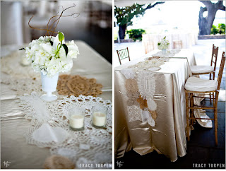
At first I was mesmerized by the beauty that is doily table runners like these:


Images via Ruffled Blog, Photos by Tracy Turpen
But then I reconsidered thinking that while beautiful, these runners were more vintage and less shabby chic.

The doilies did get me thinking though. (Thinking about lace!)

Image via Weddingbee Classifieds, photo by juneg
I loved this option as well, but I was jonesing for more color!

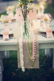
My next inspiration was the ribbon table runner. I imagined a more "finished" version of this (perhaps with a yellow backdrop rather than the burlap):

Image via Emmaline Bride via Ucreate Parties
Or something like this with a bit more color:
Image via Project Wedding via Elizabeth Anne Designs
 The ribbons were definitely a contender. Shabby chic? Yes. Feminine? Y.E.S.

But there was always old faithful, the patterned table runner:
Image via Etsy shop Floratouch
Simple, classic, and preppy. I could not go wrong with this option.

I've got to be honest and admit that I still haven't made a final decision. But I have narrowed it down to the classic patterned runner or the ribbon runner that I could DIY. (I'm feeling a project coming on!)

Did you decide to use a runner or did you chose to stick with the classic tablecloth?
Sunday, October 16, 2011

Tasting - Take Two

Recently we ventured back on over to Williamsburg for our actual tasting/open house with the caterer. (I say actual because of my bridal scatterbrain induced date mix-up the previous weekend.) This was our first opportunity to try some of the tasting offerings from our caterer. Every quarter, the Catering Co. typically holds Open House tastings along with a couple of other local vendors to showcase their work. Since it was being held at William and Mary's Alumni House, I knew that it was going to be a nice event, but I wasn't prepared for what we walked into. The entire main floor was pretty much set up for a reception. There was an extensive appetizer display with fresh fruits, cheese and dips, a lemonade bar, and several food stations all styled. Additionally there were several set tables all featuring individual themes with complementary floral arrangements and unique china settings. There was even a bar set up to try cocktails, wine, and beer. (If you can't tell, I was quite impressed!)


It was great to sample the food and I was all over that lemonade, but what really got me was seeing the actual settings in person and witnessing the styled tables and food stations. It was amazing and truly a testament to how well the caterer and florist work together to create a cohesive, unified look. (We hadn't even spoken to the florist at that point and I was already on her bandwagon!)


I don't know if Mr. Hawk was quite as enthused as I, but I definitely believe that the Open House was worth another trip to Williamsburg. (Honestly it would have been even if only for the food, but all the inspiration put it over the edge for me.)

Did you ever find inspiration from an unexpected source?

All photos personal

Wednesday, October 5, 2011

Aqua Blue to the Rescue!

Remember my initial color inspiration and how I eventually chucked it to start anew? Well y'all, I’m ready to share a very important update! I've finally found the inspiration I was looking for! I knew that I was all about yellow, but for some reason I was fighting my girly-girl nature. I must admit that it took a lot of long hours in front of the computer screen, but with my (non-DIY'd) blue mason jars in hand, I knew I was onto something. The combination was fresh and springy, perfect for our May wedding. Aqua blue and yellow, it was! (Phew, that was easy! Who would have known those little jars would have been so instrumental in my decision?) But just to prevent any future waffling and wavering on my part, I decided to throw in some green and rose pink accents. (See, I couldn’t fight the pink!)

Top Row: Bouquet via Kelly's Wedding Flowers Gallery, (upper: Love Birds Topper via Vintage Green Modern, Cupcakes via Wedding Magazine by Cakes by Robin , Monogram via Charming Little Nest by Southern Proper Monogram), (lower: via Hayden Olivia Photo by Critsey Rowe, Sign via Family Attic) Arrangement via White on Rice Couple
Bottom Row: Table setting via Green Wedding Shoes Photo by Edyta Szyszlo Photography, Bouquet and Bow ties via Southern Weddings Magazine Photo via 1313 Photography, Lemonade stand via Brenda's Wedding Blog photo by Bello Photography styled by Desiree Spinner Events


I don't want anything that looks too baby nursery, so I'm going to make sure to keep the yellow and aqua vibrant. (But I do love how the other colors add visual interest.) Best of all the color combination fits my vision of "southern vintage/shabby chic," which I must admit was partially inspired by our menu. 

How did you come to your final color decision? Were there other parts of the planning that helped you decide?

Saturday, October 1, 2011

OH MY, DIY!


After ditching my initial wedding inspiration, I had a new-found determination to define a style that fit me and Mr. D. Not long after beginning my search, I fell in love again. Lightning had struck twice. This time though, it didn’t feel forced.  (I swear, it felt like the skies parted and the wedding gods smiled upon me.)
Image via The Zella Guide, Via Love Notes, Photo by Stephanie Williams Photography

I ADORED the simplicity and classic beauty of antique blue mason jar arrangements, and it wasn’t just because they were “pretty.” To top it off, they were the most amazing backdrop for yellow flowers. (See what I saying about the wedding gods?) The only thing holding me back from proclaiming full-on victory was cost. After some research, I found that those antiques were a bit pricey. That’s when I found a DIY tutorial from Bridal Buzz.


I must admit that when it comes to crafting, I am pretty confident about my abilities. I don’t claim to be “artsy,” but I’ve always counted myself as “crafty.” Besides, every sorority girl worth her weight should know her way around a Hobby Lobby. (Hello t-shirts, hand-painted frames, and personalized anything-that-will-stay-still-long-enough to be puffy painted/embroidered/sharpie-d... you get my point.) Anyways, Bridal Buzz's mason jars stained blue to appear like the antique blue ball jars seemed like a great way to save a couple bucks.


I got some gals together and after several stops, we had a case of mason jars, Vitrea 160 glass paint in turquoise, Vitrea thinner, and I was ready to go. When doing a search of using Vitrea glass paint, I had seen several different comments about the best application methods. Some said using brushes and others said wiping on gave the best results. 


Personal Photos


I put on some plastic gloves (blue jars? cute. blue fingers? notsomuch.) and mixed the paint (3 parts thinner to 1 part paint).


I began by applying my paint mix with a paper towel. (Too streaky!) I tried an old t-shirt. (The shirt absorbed too much paint and was still too streaky!) I tried cheesecloth. (You guessed it, too streaky.) I even tried a two-coat combination. I wiped on in small sections. I wiped the whole glass at once. Nothing worked. The only method that appeared to be streak-free was rolling the glass in the paint/thinner combination, but it resulted in completely opaque color, which was obviously not the look I was going for. Although I never tried with a fan brush, I’m pretty sure I wouldn’t have been pleased with the results.

Personal Photo
(From left to right: authentic blue ball jar, double coat, paper towel application, cheesecloth application)
I broke down and ordered the real thing from ebay [sigh]. My first DIY = failure. Perhaps I had unreal expectations of what the end result would be or maybe my perfectionism reared its ugly head. Whatever the reason, I knew that I wasn’t going to be satisfied with the results of this project. To save myself some frustration, I threw in the towel (and cheesecloth).


Personal Photo of the ebay purchase along with some arrangement inspiration
Have you ever started a DIY that you had to abandon?

Friday, September 30, 2011

The Gray Days

Even before I received the good news about Wren Chapel, I was thinking about wedding colors. Since I was a child, I’ve had a love affair with pink. Ever the perpetual girly girl, pink and I made sense together; however, when it came to wedding planning, I never even considered pink. From the very beginning, it has been all about yellow. Yellow roses have been my favorite flower for as long as I can remember. Maybe it’s because they remind me of the great state of Texas, where I lived for several years. <3 I can’t pinpoint when or why I started loving them, but there’s something about yellow roses that just makes me happy.

Since yellow flowers were pretty much a non-negotiable, I began researching complementary colors. That’s when I first came across the modern and sophisticated combination that is yellow and gray. [Swoon.] There’s something about these colors together that is incredibly chic. Being the little type-A planner I am, I immediately started printing pictures of flower arrangements, table settings, and bridesmaids dresses that fit the style. I shared my photos with a few friends and they were all completely on board.


Photos by Stephanie Williams Photography, Event by Dazzling Details
Not too long after my decision was made, doubts started creeping up. (Or maybe “got louder” is the right way to explain it. There was always a little piece of me that didn’t identify with the combination, but it started to bother me more.) I loved the yellow (hello, that’s how I started!) but the gray was started to look dreary, industrial, and impersonal to me. The thought of having my ‘maids in gray dresses was depressing. I think that the pink-lover in me was screaming to come out and splash a little more color into the wedding day palate. I actually tried to fight it for a couple weeks but I eventually gave into my gut. I L-O-V-E-D the look of yellow and gray, but it really wasn’t me. I needed more color. I needed a little less modern and a little more shabby chic. That’s when I pretty much chucked my previous inspiration boards and went back to the drawing board (or inspiration board in this case ;) ).

Was there a time where you had to follow your gut instead of your head? Was the process of choosing your colors a snap or like me, did you flounder a bit?